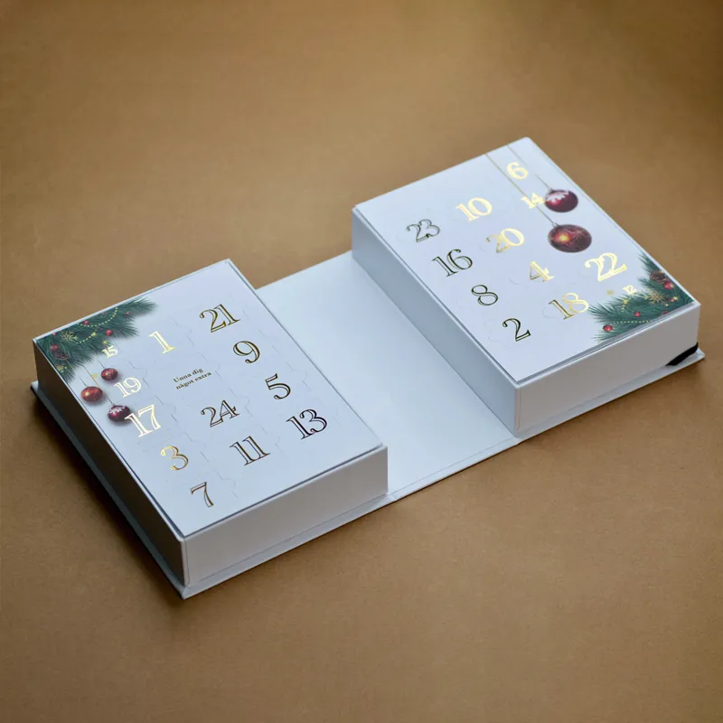
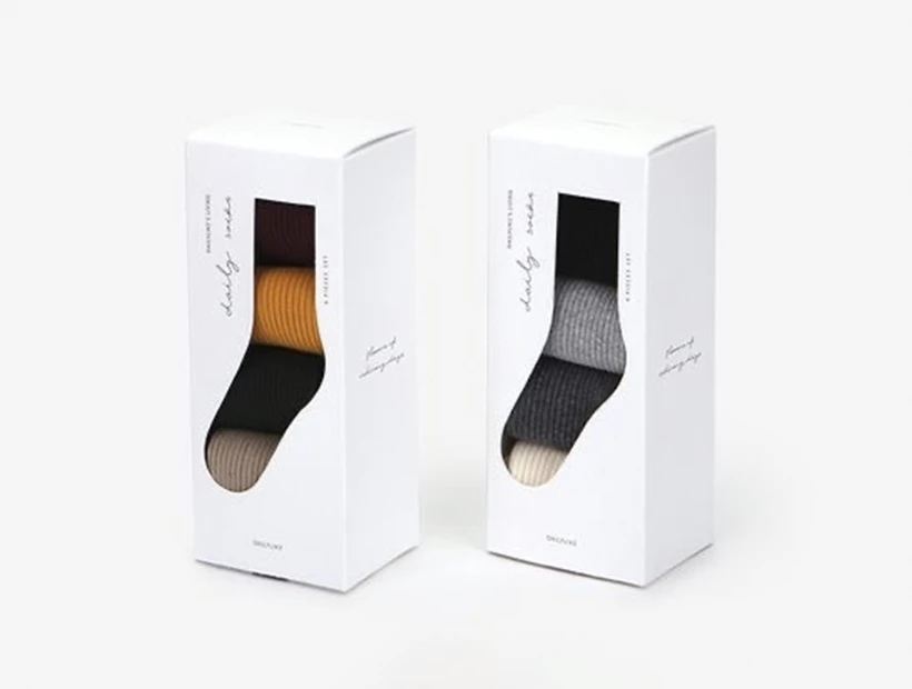
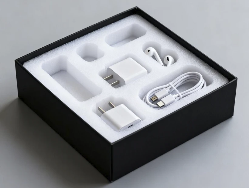
Product presentation is one of the crucial parts of business. How your product is packaged and presented influences a large part of your sales. Over the years, minimalist packaging has emerged as a powerful design trend, with simplicity and functionality. It basically involves doing away with unnecessary elements in the materials and visuals of the packaging, yet communicating the company’s intention.
In this article, we will discuss professional tips on how to create minimalist packaging boxes that will effectively enhance your brand identity. But before that, let’s dive deeper into what minimalist packaging is and its benefits.
What is Minimalist Packaging?
Minimalist packaging refers to creating a packaging box design with fewer materials and visuals. It focuses on simplicity, using a limited color palette and clean lines to convey the brand’s message. The aim is to minimize the material used and visual noise, thereby communicating the brand’s identity in the most basic form.
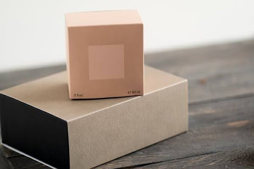
Benefits of Minimalist Packaging
Perhaps you are unwavered about adopting minimalist packaging, here are three major reasons why you should switch your packaging to the minimalist style.
Reflects Brand Values
Consumers are more intrigued when they see unique packaging. They tend to share their unboxing experience if the products are packaged in boxes different from the norm. Hence, why it’s important that you stand out from competition by exploring minimalist packaging that showcases your brand values.
Cost-Effectiveness
Using fewer materials and streamlined processes, which results in reduced expenses. This enhances better profit margins, allowing entrepreneurs to sell products at cheaper prices. Businesses can conveniently lower shipping fees or reduce product costs without affecting their profit.
Reduces Environmental Impact
Minimalist packaging involves cutting down on the use of materials and equipment, resulting in a reduction of environmental impact. This packaging trend eliminates waste from complicated or oversized boxes, which is a great addition to the sustainability of the environment. Plus, using eco-friendly labels and stickers can reduce your carbon footprint.
Design Factors for Minimalist Packaging
There are definitely benefits for using minimalist packaging, however they must be properly designed for complete effectiveness. That is why we’ve made a compilation of expert tips in creating the best minimalist packaging box for your business.
Color Palette
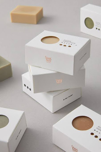
Choose a limited color scheme. Using a variety of colors on a packaging surface is unnecessary. Go with one color, or at most two colors. However, ensure the colors you choose are compatible with your brand and shouldn’t interfere with the visibility of your brand name or logo.
In fact, who said packaging must be colored or include artworks? Minimalist packaging standard suggests embracing white space, allowing the designs to breathe and preventing overcrowded visuals. Giving room for white space ensures clarity, which makes the packaging more sophisticated.
Typography
The typography should be simple and impactful, while aligning with your brand’s personality. Use clean and easy-to-read fonts to create a seamless connection with customers. In a shelf with many choices, consumers will only choose a product they can easily read through its package for needed information. Consumers won’t strain their eyes, especially when there are other options with clearer fonts.
In addition, your font size and text placement must be technically correct. The text should not be too big nor dominate the design. Also, having the right placement ensures that the marketing information is communicated effectively without overwhelming the viewer’s understanding.
Using a consistent font style across different packaging elements helps maintain coherence.
Imagery and Graphics
When including images and graphics in your design, make sure you use those that align with your brand and product’s essence. Keep them simple. For example, if you are creating packaging for sanitation equipment, use an image or graphic that contributes to clean and purposeful aesthetics.
Incorporating abstract or geometric patterns can also add a touch of elegance and visual interest to the packaging. But, you must be careful with this in order not to affect the design simplicity.
Packaging Structure and Materials
Another factor to consider in a minimalist packaging buying guide for your business is the structure and materials used.
Size and Shape
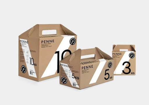
Purposeful dimensions will make you stand out from competitors. Create the packaging box depending on the shape of your product and the dimension of the packaging that will be best fitted. The size and shape of the packaging should complement the communication of your brand’s value and the product’s information. Also, consider the fragility and ease of transportation when the product is packaged.
Compact packaging enables management of materials and efficient use of space, with guaranteed protection. Smaller, well-fitted boxes help reduce environmental impact and require less energy for transportation. Furthermore, minimalist packaging with portable shape and size can improve the product’s overall aesthetic.
Sustainable Materials
Adopting minimalist packaging is integral to sustainability. Use eco-friendly materials like cardboard, paperboard, kraft paper, corrugated board, chipboard etc. It’s important that you use materials with a lower environmental footprint.
Prioritize recyclable material options, allowing the packaging boxes to be easily used for other purposes. Also, consider biodegradable materials that break down naturally, reducing environmental impact.
Simple Finishes for Minimalist Packaging
By judiciously selecting between matte, glossy, or textured finishes, your minimalist packaging can offer a nuanced visual and tactile experience.
Matte Finish
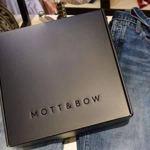
Matte finish gives the packaging a modern and elegant look, with absence of shine or luster that could increase the visual noise. It’s a simple finishing that offers a contemporary and sophisticated aesthetic.
Also, it reduces glare, thereby providing a smooth, non-distracting surface that enhances the purity of the packaging. Packaging with matte finishing doesn’t retain fingerprints, which helps to maintain the cleanliness and integrity of the minimalist design. Regardless of the number of hands that touch the packaging during transit, storage, or over the shelf, it will still be neat.
Glossy Finish
Glossy finish offers a reflective sheen, enhancing the product appeal and visibility. It increases graphics and color vibrancy, thereby drawing customers’ attention to your product.
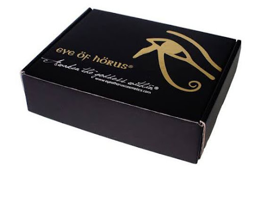
The reflective and shiny nature of the glossy finish is often associated with a sleek look that indicates premium quality product. Glossy finish creates a perception of luxury and exclusivity, making consumers feel special. Minimalist packaging with this finish shines bright on the shelf, making your brand stand out from competitors.
Textured Finish
Textured finish adds tactile interest and uniqueness to the packaging. It gives an attractive tactile dimension, which invites shoppers to check out the product. Whether it’s a mild embossing or a more pronounced texture finish, it contributes to the overall design of the packaging. Its peculiarity intrigues customers, making them walk down to the shelf to interact with the product, with a very high tendency to buy.
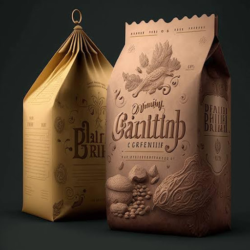
Textured finish, when done with finesse, gives a high-end and luxurious feel. The tactile appearance engages customers on a sensory level, increasing the perceived value of the product.
Logo and Branding Elements
Now, let’s explore the strategies for logo and branding elements for minimalist packaging design:
Simplifying the Logo Design
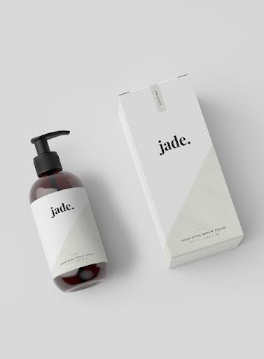
One of the pinpoints of minimalist packaging is simplicity. This extends to the logo design. Particularly for complicated logos, simplify the designs by eliminating unnecessary elements by distilling the brand’s essence into simple shapes and lines. Go for a clean and uncluttered logo design for customers to easily recognize your brand.
Prioritize using minimalistic shapes and lines that communicate your brand’s identity clearly. Incorporating geometric shapes or simplified representations can add to the logo design look.
Consistent Branding
Consistency in branding is important. You need to stick to one identity to avoid confusing consumers. Therefore, make sure the logo and overall branding elements align with your brand’s core value and resonate with your target audience emotions. This cohesive brand identity promotes easier recognition and establishment of a strong relationship between you and your customers.
When designing various products packaging, it is essential you are loyal to the same colors and fonts. Create a personality by using a consistent color palette and font across all packages. This uniformity enhances your brand identity, making customers easily associate specific colors and fonts with your brand. A perfect example is Apple, a brand that uses white space with similar fonts across all products packaging. Another example is Muji’s “no brand” style, as all their boxes are plain.
Practical Tips for Creating Minimalist Packaging
This section discusses practical ideas for creating effective minimalist packaging that will resonate with consumers and create a lasting impression.

Understand the Target Audience
Depending on your industry, location, emerging trends, and target audience, conduct a thorough market research to understand how consumers think and how your competitors operate. Conduct surveys, gather feedback, and analyze market data to gain knowledge on what influences the market. Having solid information about these determinants will help you customize the packaging effectively.
After understanding where the attention and interest of your target audience lies, tailor the packaging to appeal to their needs. Focus on using elements that align with their cultural nuances, lifestyles and preferences. For instance, if you trade in an environment where consumers are eco-conscious, use packaging made with sustainable materials.
Maintain Simplicity and Clarity
Embrace simplicity by avoiding excessive visual clutter. Minimalist packaging involve fewer visuals, hence each element on the packaging should have a purpose that contributes to the overall message of the design. Therefore, eliminate unnecessary graphics or text that don’t add to the brand’s core value.
Furthermore, use clear and concise text to communicate information. With minimal language, ensure the text on the packaging is clear and easy to understand. Focus on key information like brand name, logo, product name, and the benefits.
Minimalist Packaging for Different Industries
Let’s examine how practical minimalist packaging impacts different industries, using two major industries as case study.
Food and Beverage Packaging
Everything associated with food and beverage must exude cleanliness and simplicity. When making decisions about food, consumers are often strict. Thus, you need a compelling packaging that states the product information clearly, such as the product type, flavor, nutritional benefits, how-to-use instruction, etc.
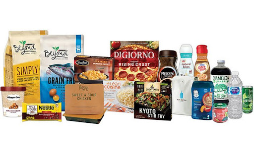
Incorporating clean backgrounds and niche graphics for food, beverages, fruits, or chocolate packaging can increase the appetite of consumers, making them buy your product.
Minimalist packaging is beneficial in this industry for portion control and nutritional information. The clean and simple designs allow consumers to easily assess the serving sizes and dietary restrictions. This is very important in the food and beverage industry as customers’ loyalty often lie with brands with informative and impactful packaging.
Cosmetics and Beauty Packaging
For cosmetics and beauty packaging boxes, elegance and sophistication is paramount. Creating minimalist packaging for this industry involves using sleek, clean lines with a limited color palette that exude luxury and exclusivity. These boxes are designed with matte or glossy finishes, making them look extremely attractive and resistant to fingerprints or stains. Using embossed logos or subtle detailing can further solidify the quality and visual appeal.
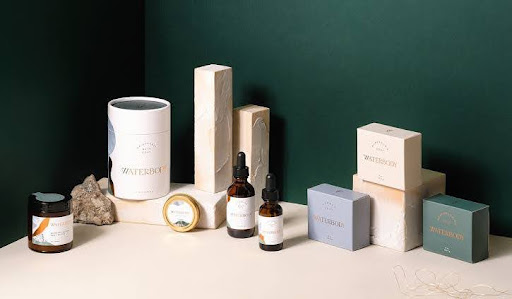
Cosmetics and beauty packaging usually use white and simple designs to showcase purity and natural aesthetic. You can also explore transparent elements like clear bottles or windows to further showcase the elegance and purity of the product. Incorporating transparent elements enables the product to take center stage, reinforcing your claim of a pure and unadulterated formulation.
Conclusion
Minimalist packaging is one of the powerful marketing trends adopted by many brands in the world. It defines the art of “less is more,” meaning that with fewer materials and visuals, you can effectively and efficiently create packages with premium product appeal and sustainability.
With the tips highlighted above, you can create functional minimalist packaging boxes that promote your brand image and product visibility. It’s however important that you conduct an in-depth survey of your target market to understand how best to captivate their attention.
At GleePackaging, we can help you create the ideal minimalist packaging box for your products. We have experts for every niche who are readily available to handle your orders. Contact us to help you design the most enticing packaging!
